MOD PIZZA
Signage & Wayfinding
Making the brand impossible to miss.
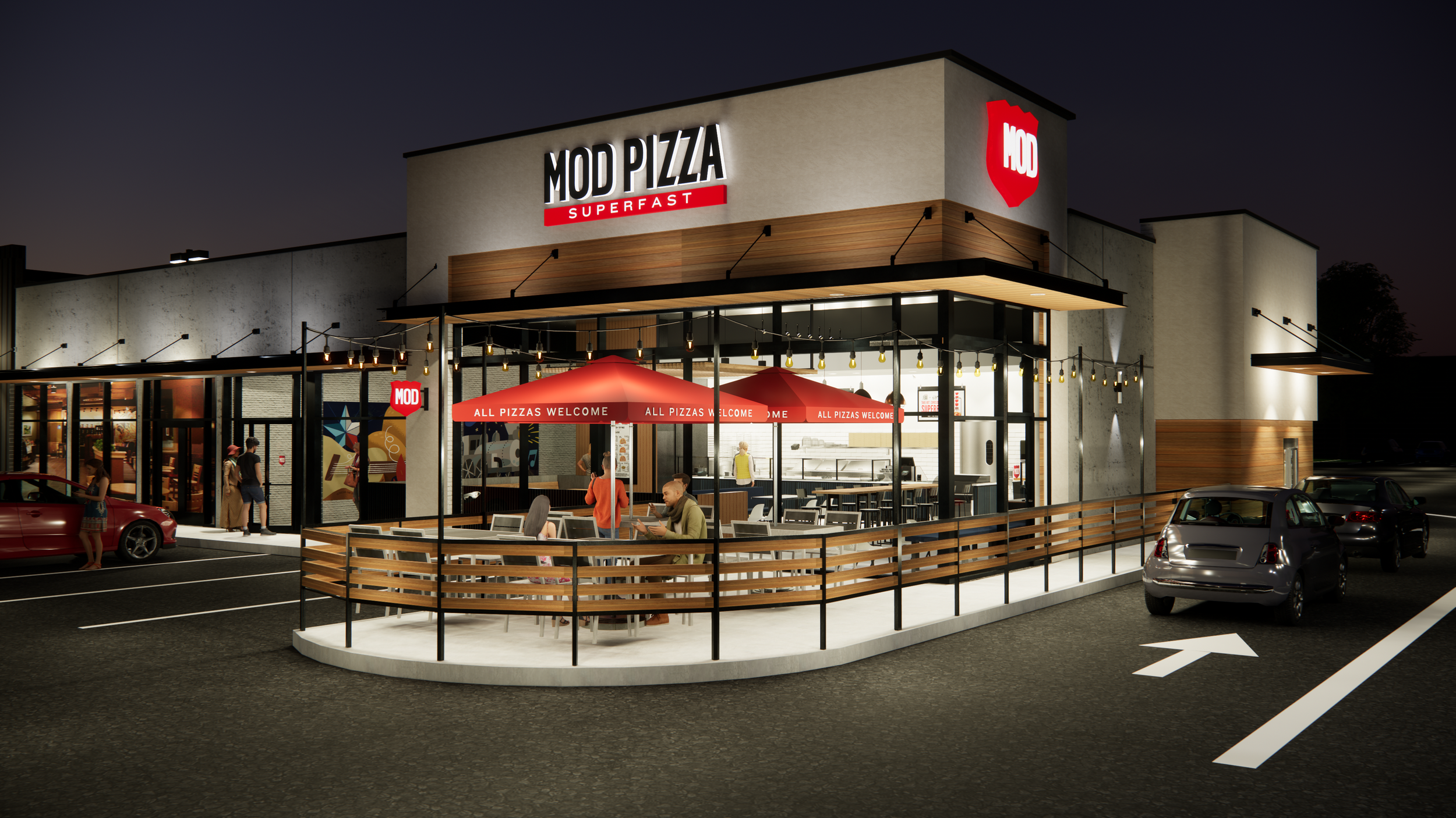
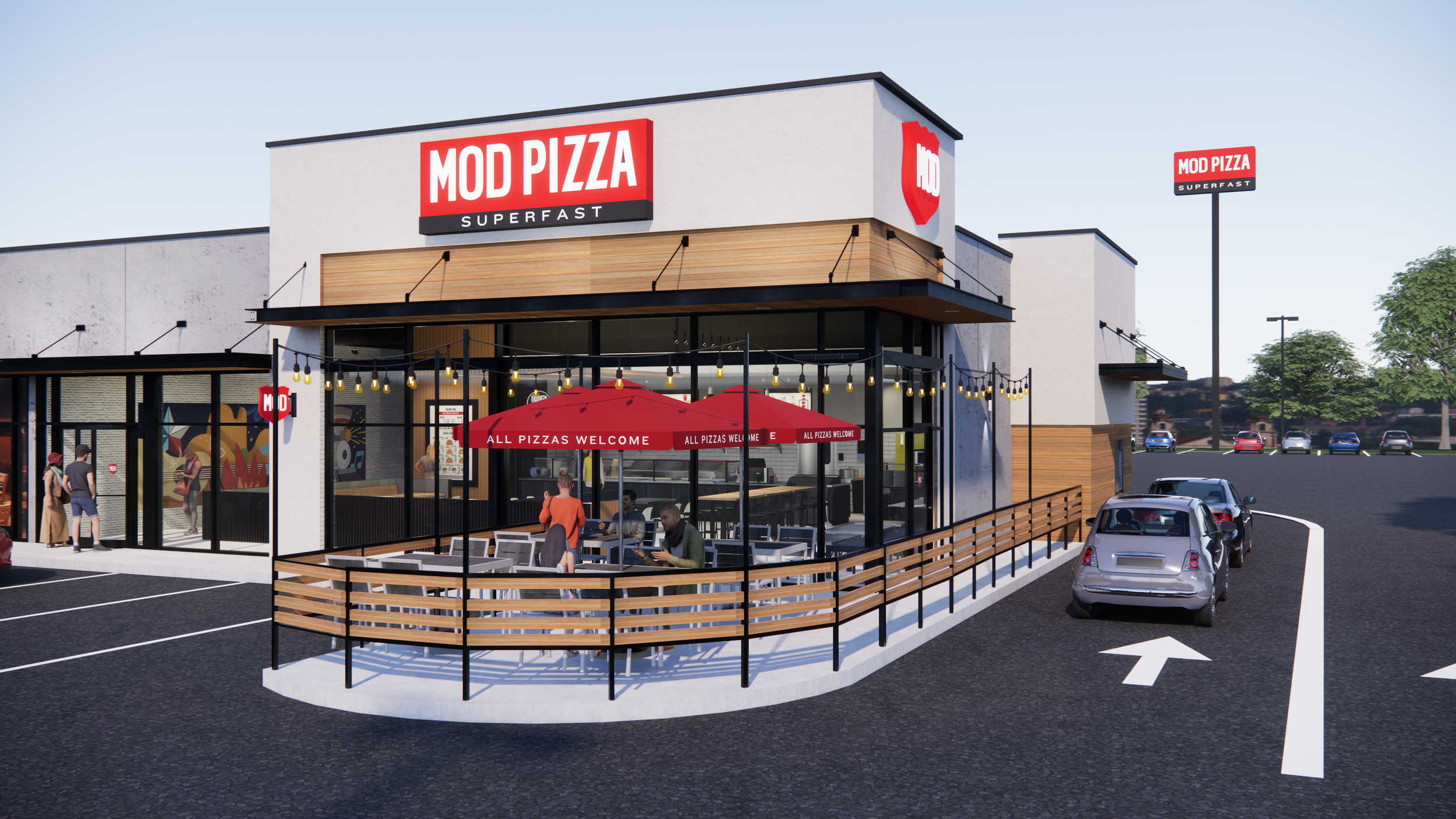
A brand doesn't live in a brand guide. It lives in the real world.As MOD evolved its visual identity, the exterior signage needed to evolve with it. In 2022, I led the rebranding of MOD's exterior signage system, translating the updated brand into a more consistent, visible, and recognizable physical presence across the restaurant portfolio. The challenge was bigger than updating a logo or changing a color. The system needed to work across different buildings, sign types, materials, lighting conditions, and customer vantage points—while still feeling unmistakably MOD.
THE BRAND UPDATE
One brighter red. One stronger signal.
One of the most significant changes was moving from MOD's previous two darker reds to a single, brighter red: PMS 185C.
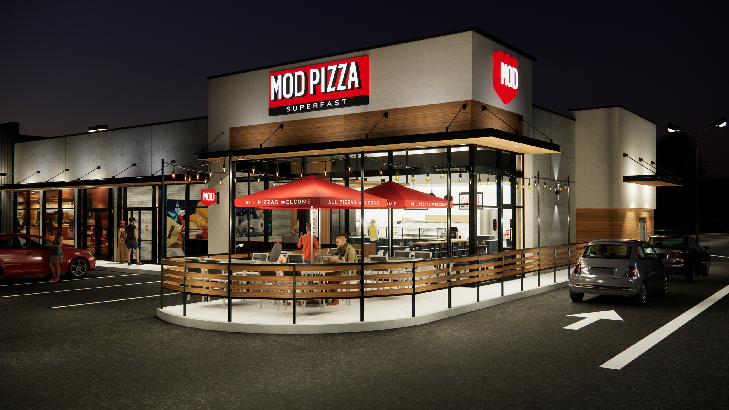
The new red became a defining element of the updated one-color badge logo, creating a more vibrant and immediately recognizable expression across exterior signage.
Rather than treating the color change as a simple brand update, I used it as an opportunity to rethink how MOD could show up from a distance—creating stronger contrast, visibility, and recognition within the built environment.

BUILDING THE SYSTEM
The signage system was designed to accommodate a range of architectural conditions and physical applications.
I developed and art directed signage solutions including:
Channel letters
Backer signs
Illuminated signage
Monument signs
Pylon signage
Badge signage
Exterior murals
Open signage
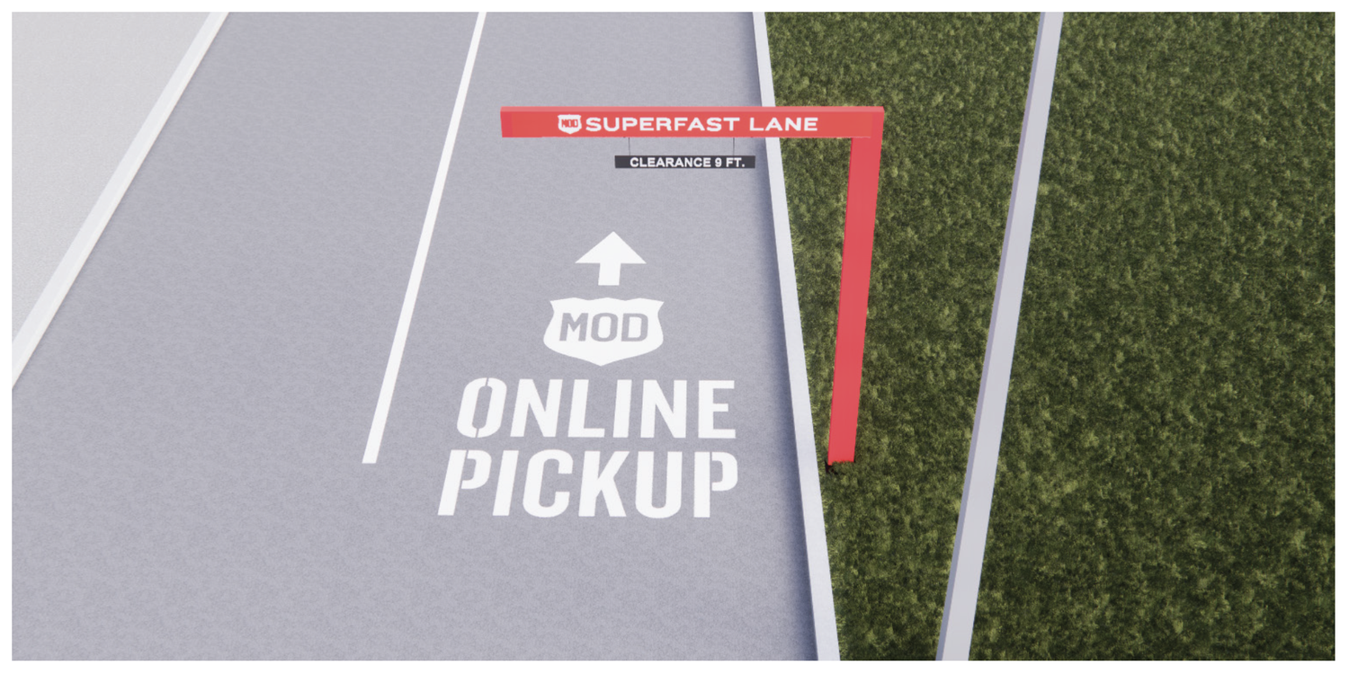
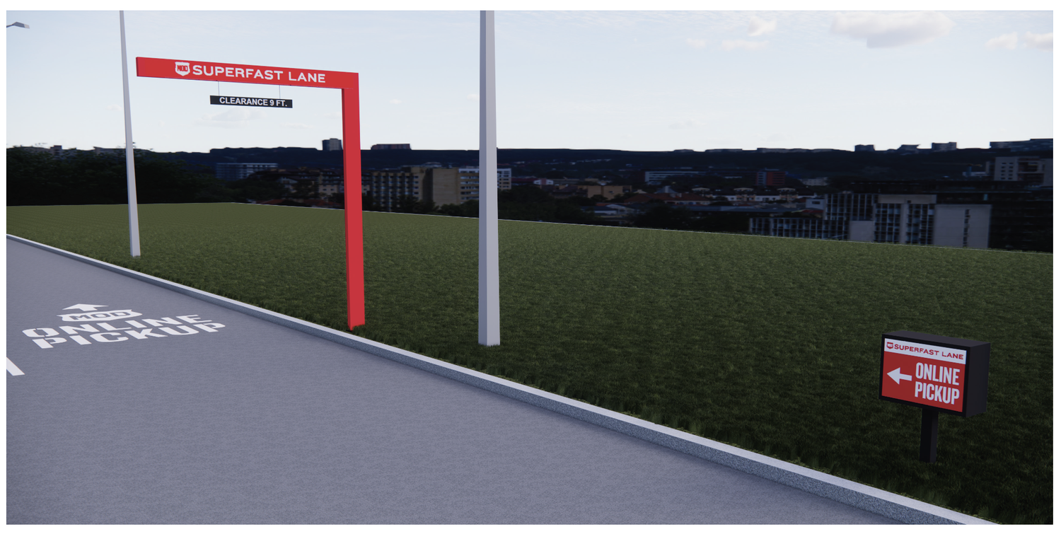
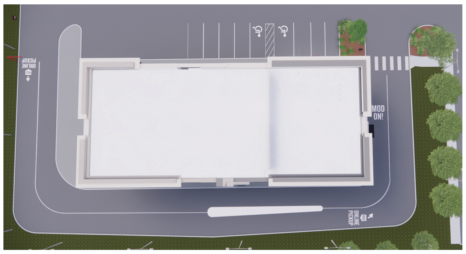
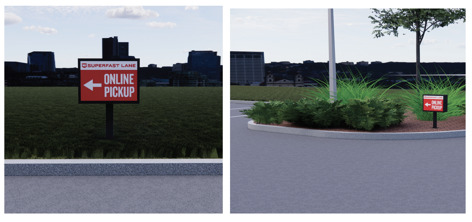
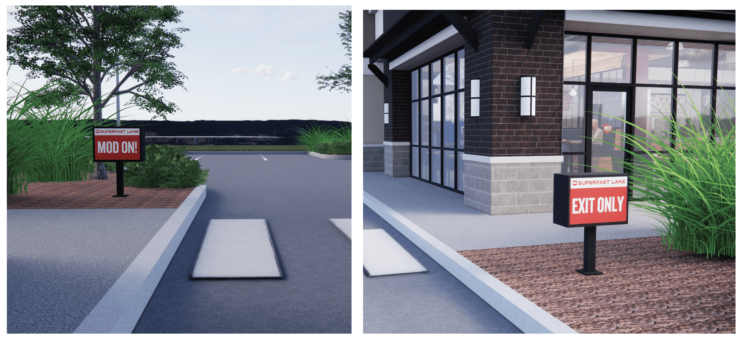
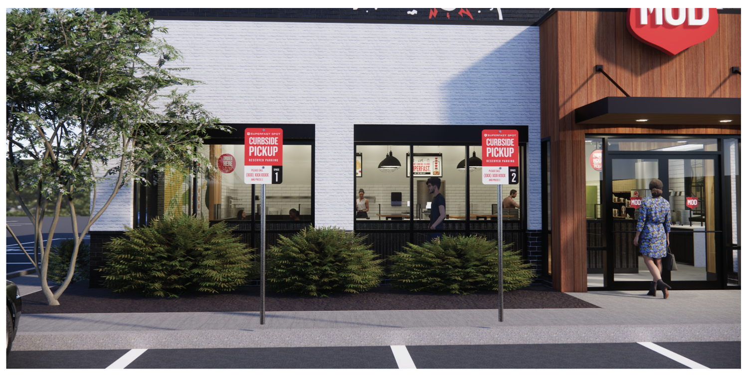
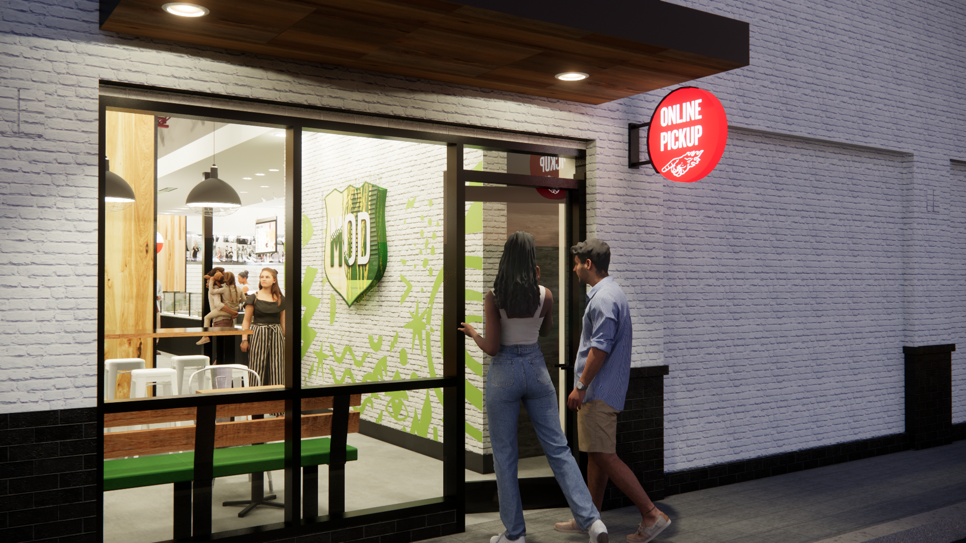
Online ordering and pickup signage
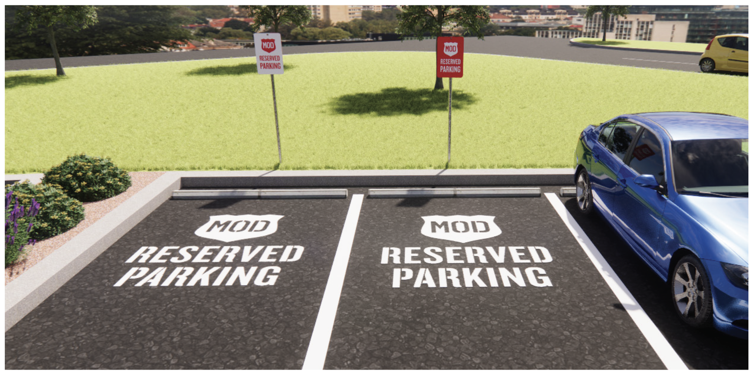
Curbside signage
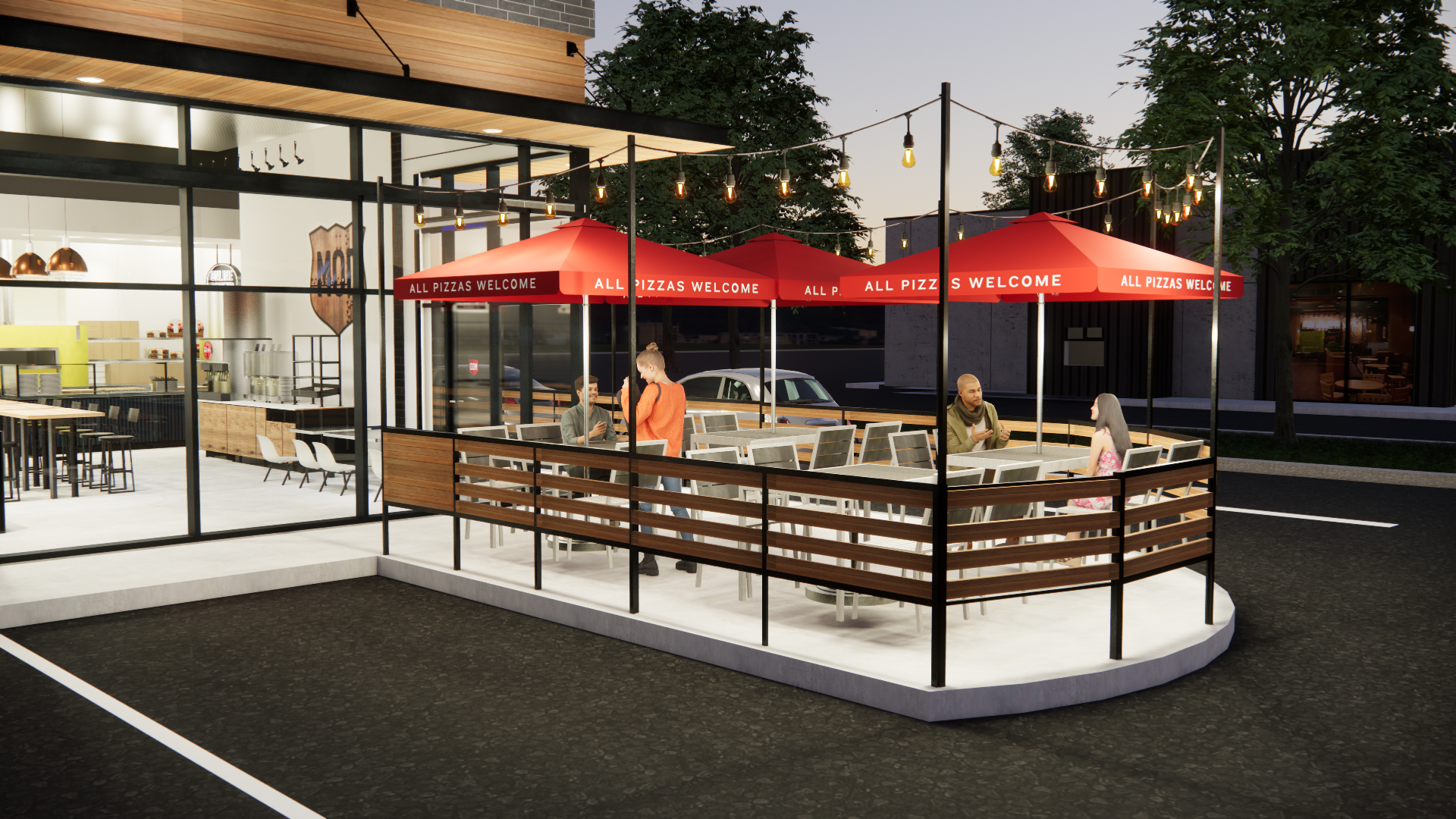
Outdoor environmental signage
The system allowed individual locations to respond to their specific architectural and site conditions while maintaining a cohesive MOD presence.
MY ROLE
Associate Creative Director
I led the creative direction and development of the exterior signage rebrand, working across brand strategy, environmental design, signage applications, and physical production.
My role included:
Translating the refreshed MOD brand into a physical signage system
Establishing the updated color and badge application
Developing signage concepts and applications across multiple formats
Art directing environmental brand expression
Considering visibility, scale, materials, and fabrication
Developing wayfinding and customer-facing signage
Partnering with internal teams and production partners to move concepts toward implementation
THE RESULT
A more cohesive physical expression of the MOD brand—designed to be brighter, more visible, more recognizable, and more adaptable across the restaurant portfolio.
The signage system became another expression of the larger MOD brand: consistent enough to build recognition, flexible enough to work across different environments, and intentional enough to make the customer experience feel connected from the moment they arrive.
From brand system to physical place.
The work demonstrates how I approach environmental design: not as decoration applied to a space, but as a strategic extension of the brand and an important part of the customer journey.
Store Execution








WAYFINDING
Brand expression meets customer experience.
Signage isn't only about being seen. It also needs to help people understand where to go and what to do next. The wayfinding system extended the updated MOD visual language into the customer journey, creating clear directional and service-oriented touchpoints around the restaurant.
The goal was to make the experience feel intuitive without adding unnecessary visual noise—using the brand's existing visual language to create clarity and continuity from the exterior into the customer experience.